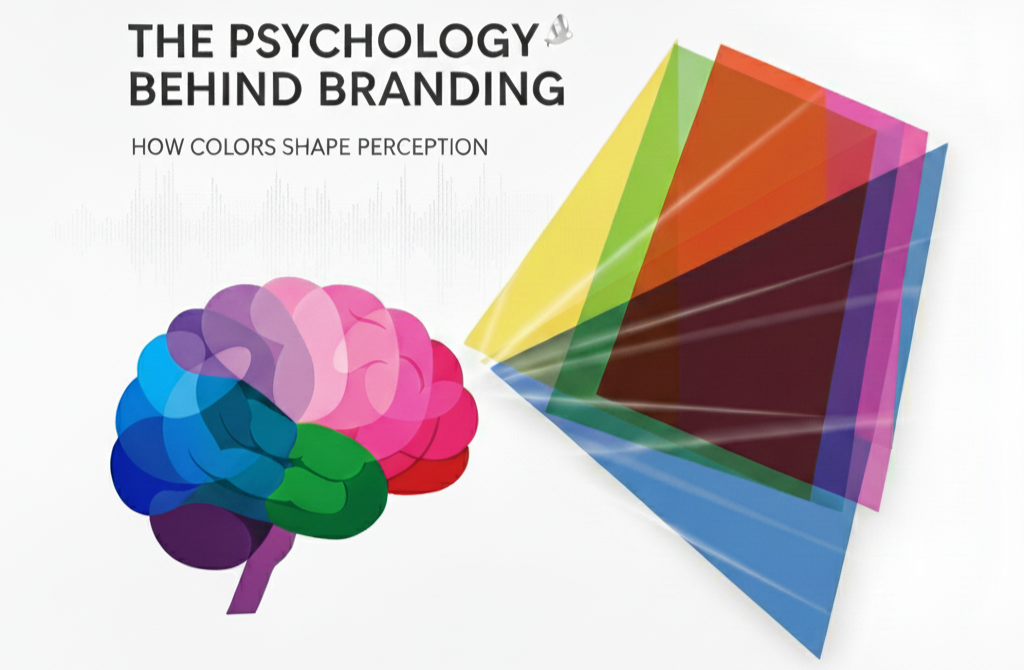
Introduction: Why Colors Speak Louder Than Words
Imagine walking into a store where everything is painted in black and red. Instantly, you feel intensity, urgency, and maybe even a sense of exclusivity. Now imagine the same store in soft blues and greens you suddenly feel calm, safe, and trusting. This shift in your emotions didn’t come from the products on the shelf but from the colors surrounding you.
That’s the hidden power of branding psychology, and at its core lies the science of color psychology in branding. For businesses aiming to stand out in a noisy marketplace, understanding how colors shape perception is not just a design choice it’s a strategic decision that can define whether your brand thrives or fades into the background.
In this blog, we’ll uncover how colors influence consumer behavior, why branding is deeply tied to psychology, and how your business can leverage this knowledge to build stronger connections, drive conversions, and create unforgettable experiences.
What is the Psychology of Branding?
The psychology of branding is the study of how design, messaging, and emotions influence how people perceive a brand. It goes beyond logos and fonts; it’s about shaping how your audience feels when they interact with your business.
At its core, branding psychology recognizes that customers rarely make decisions based solely on logic. Instead, their choices are deeply influenced by subconscious triggers trust, familiarity, status, and emotion. And among the most powerful of these triggers? Color.
Why Colors Are the Silent Language of Branding
Colors are more than visual elements they’re emotional cues that speak directly to the subconscious. In fact, research shows that up to 90% of snap judgments about products are based on color alone.
For instance:
- Red sparks urgency, energy, and passion. It’s why clearance sales often use red tags.
- Blue conveys trust, calmness, and stability making it a favorite for banks and tech companies.
- Yellow radiates optimism, friendliness, and creativity.
- Black signals luxury, elegance, and exclusivity.
When used strategically, these colors create a psychological roadmap that guides customers toward specific emotions and actions.
The Role of Color Psychology in Consumer Decision-Making
The psychology of branding colors is not random it’s science-backed. Consumers don’t just see colors; they experience them. A warm color palette can encourage impulsive buying, while cooler tones can lengthen browsing time and inspire thoughtful decision-making.
For example:
- Fast food chains like McDonald’s, KFC, and Burger King use red and yellow because they stimulate hunger and excitement.
- Healthcare and wellness brands lean on blue and green to signal calm, trust, and healing.
- Luxury brands like Chanel or Rolex stick to black and gold, exuding exclusivity and prestige.
By aligning colors with customer psychology, brands can shape not only perception but also behavior.
How Colors Build Emotional Connections with Your Audience
Emotions drive loyalty, and colors are the shortcut to creating those emotional bonds. When your brand consistently uses specific colors, customers begin to associate those colors with your values and promise.
For instance:
- A green palette instantly reminds us of sustainability, eco-friendliness, and nature.
- A red accent builds urgency and makes CTAs (calls-to-action) more persuasive.
- A blue foundation creates trust in industries where credibility is crucial, like finance and healthcare.
This emotional alignment builds brand trust, and trust is the foundation of every long-lasting customer relationship.
The Psychology of Branding Colors in Different Industries
Not all colors work universally. Each industry has its own psychological triggers, and using the wrong color can misalign your brand message.
- Technology: Blue (trust, innovation), White (simplicity), Black (modernity)
- Food & Beverage: Red (appetite), Yellow (happiness), Green (freshness)
- Fashion & Luxury: Black (elegance), Gold (prestige), White (minimalism)
- Healthcare: Blue (calm), Green (healing), White (purity)
Knowing how color psychology in branding applies to your industry ensures that your visuals not only look appealing but also resonate deeply with your target audience.
Case Study: How Color Rebranded a Struggling Business
Consider a fictional café brand, Brew & Glow. Originally, their logo was brown and grey meant to symbolize coffee and sophistication. But customers described the brand as “dull” and “forgettable.”
When the café rebranded using warm oranges and rich greens, everything changed. Orange added vibrancy and friendliness, while green connected the brand to freshness and wellness. Within three months, foot traffic increased by 35%, and social media engagement doubled.
This case highlights how a simple color shift can transform perception and profitability.
The Hidden Pitfalls of Ignoring Branding Psychology
Brands that ignore color psychology often send mixed signals. For example:
- A luxury product packaged in neon pink may feel cheap.
- A finance company using playful yellows may struggle to convey trust.
- A healthcare provider branded in black may appear intimidating rather than reassuring.
When your branding colors clash with your business values, it creates cognitive dissonance a disconnect that pushes customers away instead of pulling them in.
Benefits of Applying Color Psychology in Branding
Using colors strategically in branding provides several benefits:
- Instant Recognition: Colors make your brand memorable and distinguishable.
- Stronger Emotional Impact: They create emotional triggers that foster brand loyalty.
- Higher Conversions: Strategic use of color in CTAs and packaging drives actions.
- Consistent Messaging: Aligns brand visuals with business values.
- Competitive Edge: Differentiates you in a crowded marketplace.
Simply put: mastering the psychology of branding colors can make your brand not just visible but irresistible.
Ready to Raise Your Brand?
At RangRaise, we don’t just design logos we design perceptions. We understand the psychology behind branding and craft identities that don’t just look good but feel unforgettable.
👉 Raise Your Brand Today. Let’s create a color story that speaks louder than words.
How to Choose the Right Colors for Your Brand
When selecting your brand’s color palette, consider:
- Your Target Audience: What emotions and values do they care about?
- Your Industry Standards: Where should you align, and where can you break the mold?
- Your Brand Personality: Are you bold, trustworthy, luxurious, or playful?
- Cultural Context: Colors can mean different things across cultures.
At RangRaise, we guide businesses through these decisions, ensuring your colors don’t just look aesthetic but work strategically.
Conclusion: The Future of Branding is Psychology-Driven
Branding isn’t just about design it’s about connection. And colors are the bridge between your business and your customers’ emotions. Whether you’re aiming to build trust, spark excitement, or radiate luxury, the right color strategy can redefine your brand’s future.
So ask yourself: Does my brand color story reflect the emotions I want my audience to feel? If the answer is no, it’s time to rethink.
At RangRaise, we help brands unlock the full power of branding psychology creating identities that inspire, influence, and impact.
👉 Raise the Bar. Redefine Your Brand. With colors that shape perception and drive growth.
FAQs on the Psychology of Branding & Colors
1. What is color psychology in branding?
Color psychology in branding is the study of how colors influence consumer emotions, perceptions, and behaviors.
2. Why do colors matter in branding?
Because up to 90% of snap judgments about brands are based on color, making it a critical factor in trust, loyalty, and recognition.
3. Which color is best for branding?
There’s no universal “best” it depends on your brand’s values, target audience, and industry.
4. How do I choose my brand colors?
Consider audience psychology, your brand personality, industry standards, and cultural meanings.
5. Can colors increase sales?
Yes. Strategic use of colors in branding, packaging, and CTAs has been proven to boost conversions.
6. Do colors influence online user experience?
Absolutely web design, button colors, and overall palette directly affect engagement and user trust.
7. Should I rebrand if my colors don’t align with my message?
Yes. A misaligned color scheme can hurt credibility and prevent your brand from resonating with customers.